

What should your company headshots actually look like? Explore 17 real staff and team headshot examples from companies we’ve photographed, ranging from clean corporate portraits to bold branded backgrounds and environmental photography.
When you’re planning headshots for a company or team, one of the first decisions is how they should actually look. A simple neutral background might be perfect for one organisation, while another might want to incorporate brand colours, photograph people in their working environment or create something completely bespoke.
The examples below are all from real staff and team headshot projects we’ve photographed. Each grid shows just a small selection from the wider shoot — in some cases, the scale was considerably larger. For American Express, for example, we photographed thousands of people across multiple sites and shooting days.
From global organisations and household names to smaller teams, these 17 examples show just how different company headshots can be — and hopefully provide a little inspiration for what might work for yours.
1. American Express — Clean, Consistent Team Headshots

For American Express, the brief was all about clean, consistent and approachable headshots that could work across a large organisation. A simple neutral background keeps the focus firmly on the individual, while consistent lighting, framing and posing ensures the photographs sit naturally alongside one another wherever they’re used.
The six people above represent just a tiny fraction of the project. Across multiple sites and shooting days, we photographed thousands of American Express colleagues, so creating a repeatable setup that delivered the same standard of headshot for the first person as the last was essential.
2. BBC Studios — Bringing Brand Colour Into Team Headshots

Staff headshots don’t have to sit against white, grey or traditional photographic backgrounds. For BBC Studios, we created a much more distinctive look, combining consistent studio lighting with a bold purple gradient inspired by the brand’s visual identity.
The circular crop gives the finished portraits another layer of consistency and makes them particularly easy to use across websites, internal platforms and digital profiles. Because the background treatment is applied as part of the finished image, the photography itself remains flexible too — allowing a company to update colours or create alternative versions without having to photograph the entire team again.
It’s a great example of how team headshots can become part of a company’s wider visual identity, rather than simply a collection of individual portraits.
3. Cabinet Office — Simple, Professional Staff Headshots
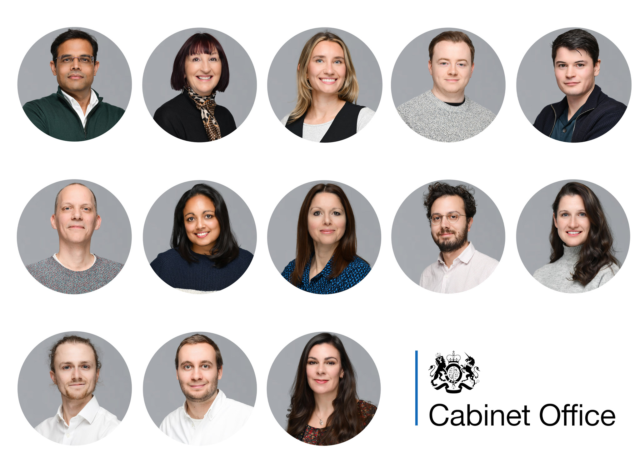
Sometimes the simplest approach is exactly the right one. For the Cabinet Office, we created clean, understated staff headshots with soft lighting, a neutral grey background and a consistent circular crop.
It’s a style that puts the emphasis entirely on the person, without tying the images too closely to a particular campaign, colour palette or visual trend. That makes neutral headshots particularly versatile — they can sit comfortably across websites, internal directories, presentations, LinkedIn profiles and other corporate communications.
The key to making a simple setup like this work is consistency across the whole team. Lighting, camera position, framing and colour all need to remain controlled so that individual portraits still feel like part of one coherent set.
4. University of Cambridge — Environmental Headshots
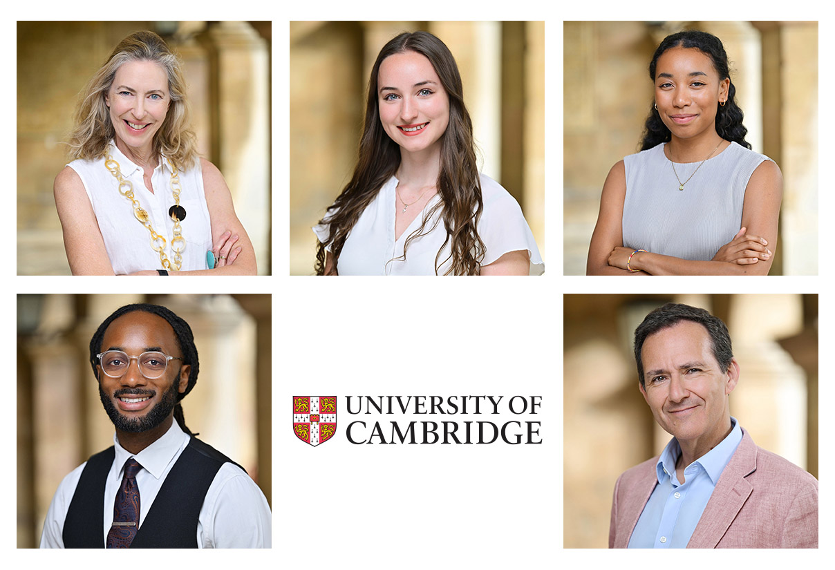
Not every team needs a studio-style background. For the University of Cambridge, we took the opposite approach, photographing people within the architecture and surroundings of the university itself.
Environmental headshots can give photographs a strong sense of place while still maintaining consistency across a team. Here, the warm stonework and softly blurred backgrounds provide context without competing with the person, while using a similar composition, lighting style and depth of field ties the individual portraits together.
This approach works particularly well when the location is part of an organisation’s identity — and few locations are quite as recognisable or characterful as Cambridge.
5. Chelsea FC — Putting the Workplace Into the Picture
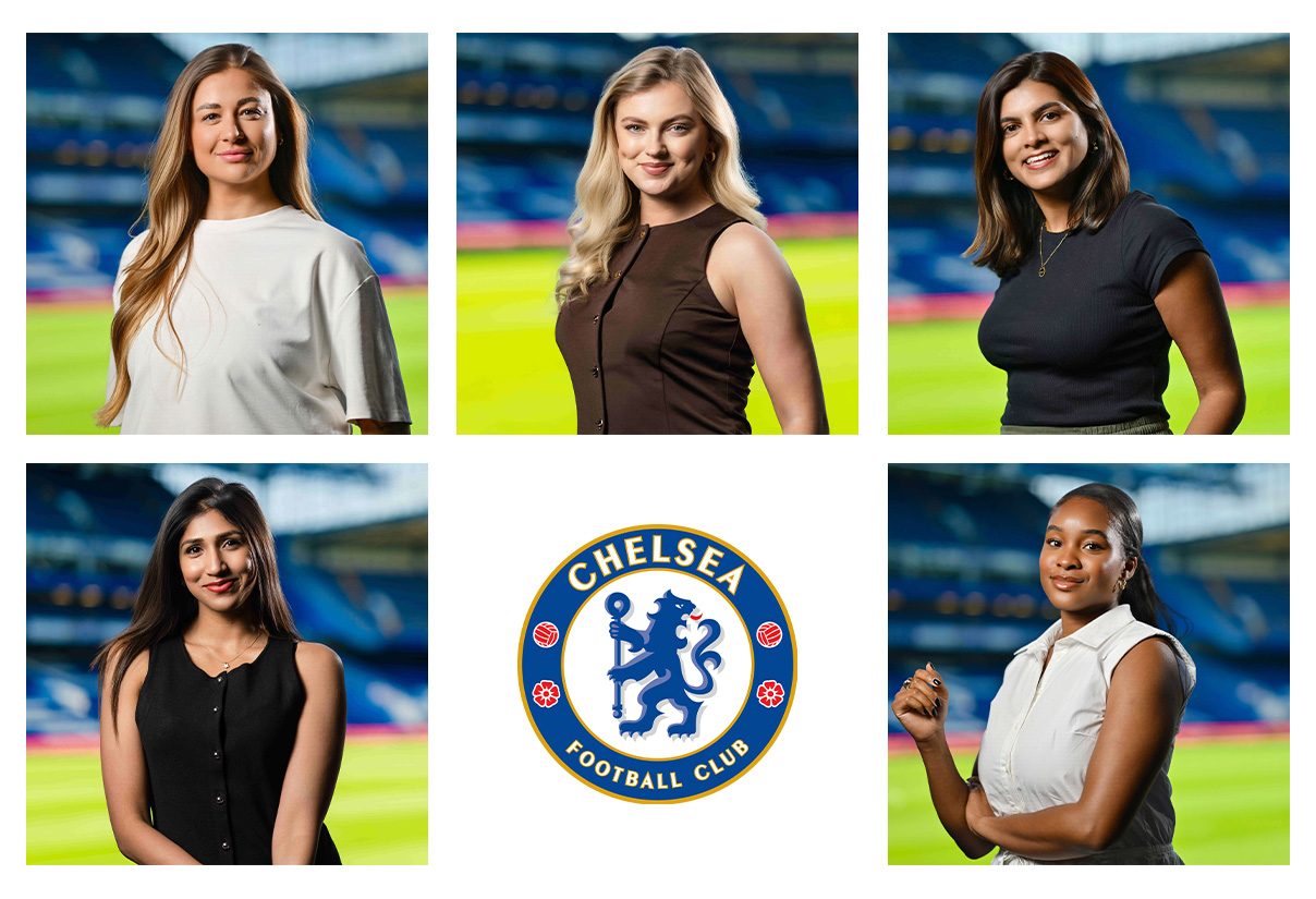
For Chelsea FC, the location was too important to hide behind a backdrop. We photographed their headshots around Stamford Bridge, using different areas of the stadium to give the portraits an unmistakable sense of place.
Although the backgrounds change from person to person, the consistent lighting, framing and photographic style ensure the finished headshots still feel like part of the same set. It’s a useful reminder that consistency doesn’t necessarily mean making every photograph identical.
For organisations with an interesting or recognisable workplace, using the environment can add personality and context to team headshots while creating something completely unique to the company.
6. Brook Green Supply — Bold, Branded Company Headshots

For Brook Green Supply, we created a bright, contemporary set of team headshots using a turquoise background drawn directly from the company’s brand palette. The result is instantly recognisable and gives the portraits far more visual impact than a traditional neutral background.
Using a brand colour consistently across staff photography can be a simple but effective way of making headshots feel completely integrated with a company’s website, presentations and marketing materials. It also means that when portraits of different team members appear together, they immediately feel like part of one visual identity.
It’s a great example of how a relatively simple headshot setup can become something distinctive simply by making the company’s branding part of the creative decision.
7. Mars Wrigley — Headshots Designed Around the Brand

For Mars Wrigley, the finished headshots were designed to work as part of a bold, highly recognisable branded visual style. Rather than relying on the photography alone, each portrait was carefully cut out and combined with the company’s rich blue background and graphic treatment.
This approach gives companies much more creative freedom. By photographing everyone consistently and separating the subject from the original background, the finished images can be adapted to fit different layouts, campaigns and digital platforms while maintaining a cohesive look across the team.
It’s a great example of thinking beyond the initial photograph and considering how staff headshots will actually be used as part of the wider brand.
8. McBains — Using Brand Colours to Create a Consistent Look
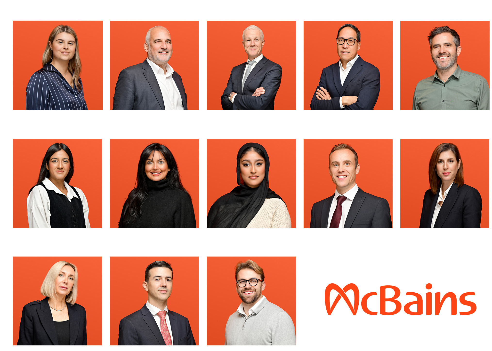
For McBains, a warm orange background taken from the company’s visual identity transforms a straightforward set of portraits into something distinctive, consistent and immediately recognisable as a team.
One of the advantages of creating a defined background treatment is that it can also make maintaining consistency easier over time. New starters can be photographed later using the same lighting and framing, then finished to match the existing team — particularly useful for organisations whose people are constantly changing and growing.
It shows that branded staff headshots don’t need to be complicated. A strong colour, consistent photography and a simple repeatable treatment can be enough to create a really cohesive set.
9. Mimecast — Black & White Team Headshots
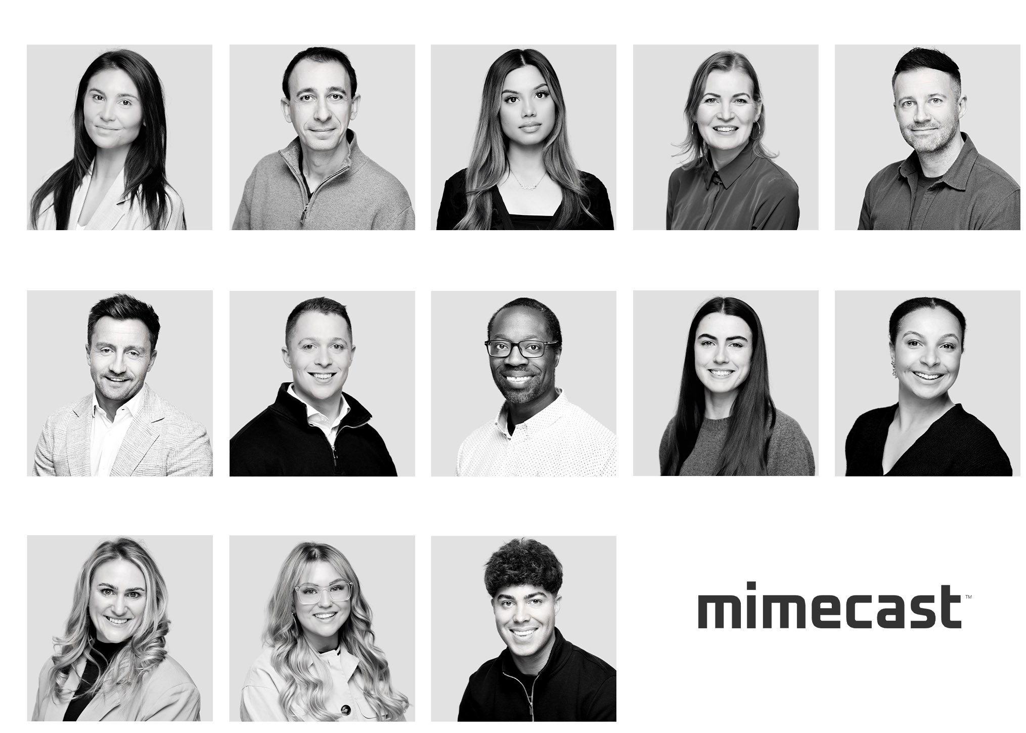
Black and white can give team headshots a completely different feel. For Mimecast, removing the colour creates a clean, confident and timeless set of portraits, with the emphasis firmly on expression, lighting and the individual.
It can also be a surprisingly effective way to create visual consistency. Differences in clothing colours and other distractions become much less prominent, helping a large collection of individual portraits sit together more naturally.
Black and white certainly won’t suit every company’s visual identity, but when it does, it’s a simple way to give corporate headshots a distinctive style without relying on bold backgrounds or graphic treatments.
10. Nextbase — Headshots Designed for Digital Use

For Nextbase, the finished portraits were created with their digital use in mind from the outset. Consistent framing, circular crops and a subtle branded gradient give the individual headshots a polished, uniform appearance when they’re displayed together.
Thinking about where photographs will ultimately appear can influence everything from composition and cropping to background choice. A headshot destined primarily for a company website or internal profile system may need to work very differently from one intended for press releases, presentations or printed material.
By planning for those uses before the shoot, team headshots can be delivered ready to slot naturally into a company’s existing design rather than having to be adapted afterwards.
11. NHS — Creating a Recognisable Team Style

For the NHS, we used a strong blue background that immediately feels at home alongside the organisation’s familiar visual identity. Combined with clean lighting and consistent framing, it creates a set of portraits that feels professional and approachable while remaining unmistakably connected to the brand.
For larger organisations, that visual consistency becomes particularly valuable. Headshots might appear across websites, internal communications, presentations, event materials and countless other places, often alongside photographs taken months or even years apart.
Establishing a clear photographic style from the beginning provides a template that can be followed as the team grows — helping new headshots sit naturally alongside the existing library rather than looking like a completely separate shoot.
12. Paragon — Bright, Approachable Staff Headshots

For the NHS, we used a strong blue background that immediately feels at home alongside the organisation’s familiar visual identity. Combined with clean lighting and consistent framing, it creates a set of portraits that feels professional and approachable while remaining unmistakably connected to the brand.
For larger organisations, that visual consistency becomes particularly valuable. Headshots might appear across websites, internal communications, presentations, event materials and countless other places, often alongside photographs taken months or even years apart.
Establishing a clear photographic style from the beginning provides a template that can be followed as the team grows — helping new headshots sit naturally alongside the existing library rather than looking like a completely separate shoot.
13. Quantum Mortgages — Consistent Headshots Without Losing Personality

Consistency is important when photographing a company team, but that doesn’t mean everyone needs to look or pose exactly the same. For Quantum Mortgages, the bold orange circular treatment creates the visual connection, while each person is still able to come across naturally as an individual.
That balance is something we aim for on every team shoot. Lighting, framing and the finished treatment can remain consistent, while expression and body language are adapted to suit the person in front of the camera.
The result is a set of company headshots that clearly belongs together, without feeling overly rigid or formulaic — consistent enough to represent one brand, but relaxed enough to represent the people behind it.
14. Softwire — Warm, Relaxed Team Headshots

Corporate headshots don’t always need to feel particularly corporate. For Softwire, we created a warmer, more relaxed style of portrait, combining natural expressions with a soft background treatment that complements the company’s visual identity.
The overall feel is deliberately friendly and informal while still maintaining the consistency needed across a larger team. This can work particularly well for companies whose culture and employer brand are centred around being approachable, collaborative and people-focused.
Ultimately, the best style of team headshot should feel like an extension of the organisation itself. Photography that suits a traditional professional services firm won’t necessarily be right for a technology company — and that’s exactly why there isn’t one ‘correct’ way to photograph a team.
15. Influencer — Contemporary Headshots With More Character

For Influencer, we wanted the headshots to feel modern, confident and a little less conventional. The bold red background gives the finished set an immediate visual identity, while the lighting and relaxed direction keep the portraits feeling contemporary rather than traditionally corporate.
A more creative approach like this can work brilliantly for companies whose brand has a strong personality of its own. The goal isn’t simply to make everybody look professional — it’s to create photographs that actually feel at home alongside the organisation’s existing design, culture and communications.
It’s a good example of how company headshots can have plenty of personality while still maintaining the consistency needed across an entire team.
16. Amazon — Classic Corporate Headshots at Scale

For Amazon, we created a clean, straightforward style of corporate headshot designed to work consistently across a large and varied team. A neutral background, controlled lighting and simple framing keep the portraits professional without introducing unnecessary visual elements that could date the images or restrict how they’re used.
For large organisations, simplicity can be a real strength. A clearly defined photographic setup can be reproduced across different shooting days, locations and groups of people, helping to maintain a consistent visual standard as the company’s image library grows.
It’s proof that team headshots don’t always need an elaborate branded treatment to be effective — great lighting, natural expressions and strong consistency can do all the work.
17. UKTV — Making Team Headshots Part of the Brand

For UKTV, we combined clean, consistent portrait photography with a bold coral background that ties the finished headshots directly into the company’s visual identity. The treatment is simple, but when the portraits are viewed together, the result is a really strong and cohesive set.
That’s perhaps the biggest takeaway from all 17 examples. There isn’t a single style of staff or team headshot that’s right for every company. Neutral backgrounds, environmental portraits, black and white photography and bold brand colours can all work brilliantly — the important thing is choosing an approach that feels right for the organisation and the people within it.
So, What Should Your Team Headshots Look Like?
As these examples show, there really isn’t one right answer. The best approach depends on your brand, your people and how the finished photographs need to be used.
For some companies, clean headshots against a neutral background provide exactly the consistency and flexibility they need. For others, incorporating brand colours or photographing people within their working environment can create something far more distinctive.
The important part is deciding on a style that can work across the whole team — and continue to work as that team changes and grows. That means thinking not only about how the photographs look today, but how easily new starters, remote colleagues and future shoots can be matched into the existing set.
If you’re not sure which approach would work best, that’s absolutely fine too. Helping companies develop the right photographic style is part of what we do.
Planning New Headshots for Your Team?
From small leadership teams to projects involving thousands of people, we manage the entire process — from planning and photography through to image selection, retouching and delivery.
Recent Comments